

quickshift
a website that helps four kinds of customers find the supply-chain services that fit their business, from freight to the final mile.

the new homepage—one value proposition in the first fold, with a cityscape that narrates the service.
ROLE
[role]
TEAM
[team]
TIMELINE
[timeline]
RESPONSIBILITIES
research with the company and its users
visual language and brand identity
information architecture and UX writing
CONTEXT
quickshift runs supply chains for brands, from freight to the final mile. it serves businesses (B2B and B2C), direct-to-consumer brands and omni-channel partners, and its old website explained everything to all of them at once.
THE SITE SERVES
04
kinds of customers: B2B, B2C, D2C and omni-channel partners.
03
key pages redesigned: the homepage, international shipping and processes.
02
research focal points: the company’s vision and its users’ needs.
PROBLEM
one website, four audiences.
each segment comes with its own priorities, technical knowledge and expectations. the old site answered all of them in the same text-heavy sections, so every visitor had to sort through information meant for someone else.

ex 1/ old site—the process page read like a maze of technical terms and scattered actions.
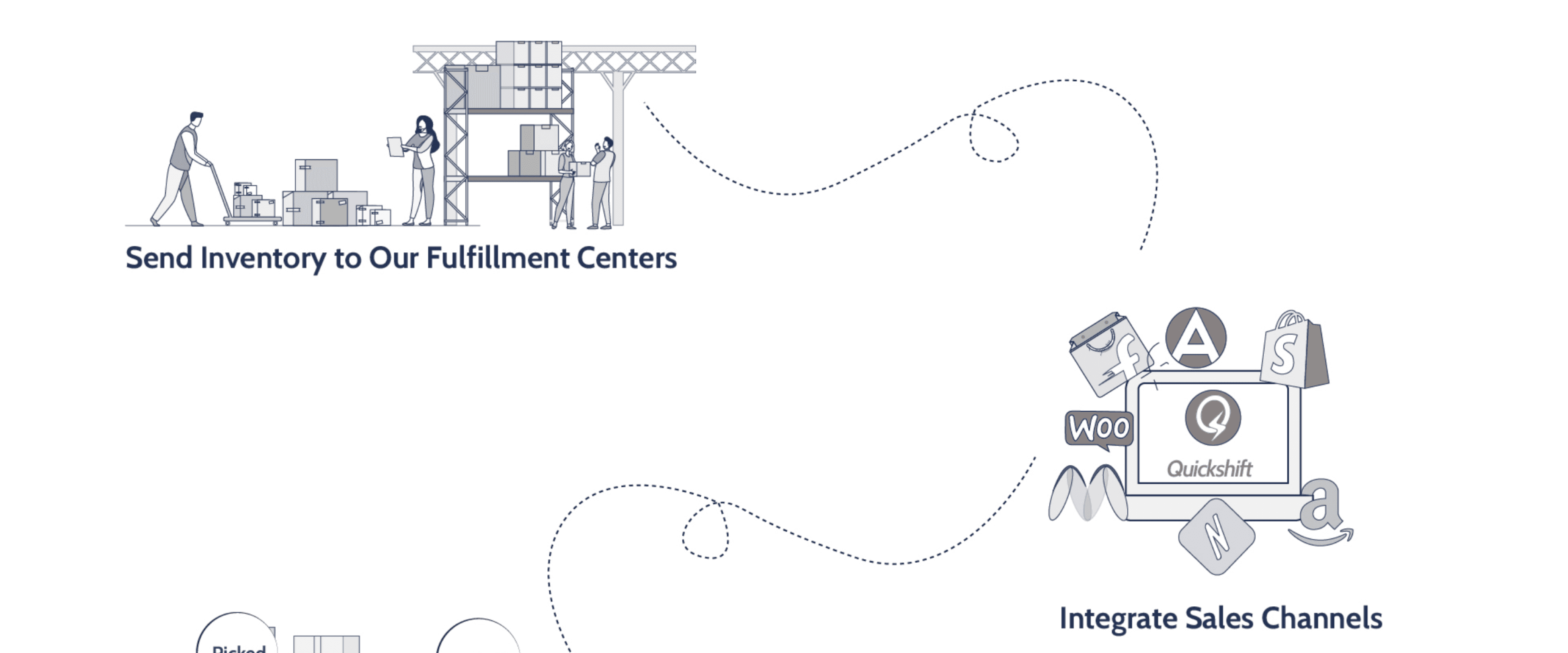
ex 2/ old site—competing visuals and long sections, with no clear focal point.
INSIGHT
the challenge wasn’t adding information. it was showing each audience only what it needs.
so i designed one site that doesn’t alienate or overload any group.
PROCESS
1/ understand the company and its users.
research had two focal points: the company, to uncover its vision for the brand, and its users, to understand how differently each segment approaches the site.
PROCESS
2/ make the homepage an entry point, not a documentation hub.
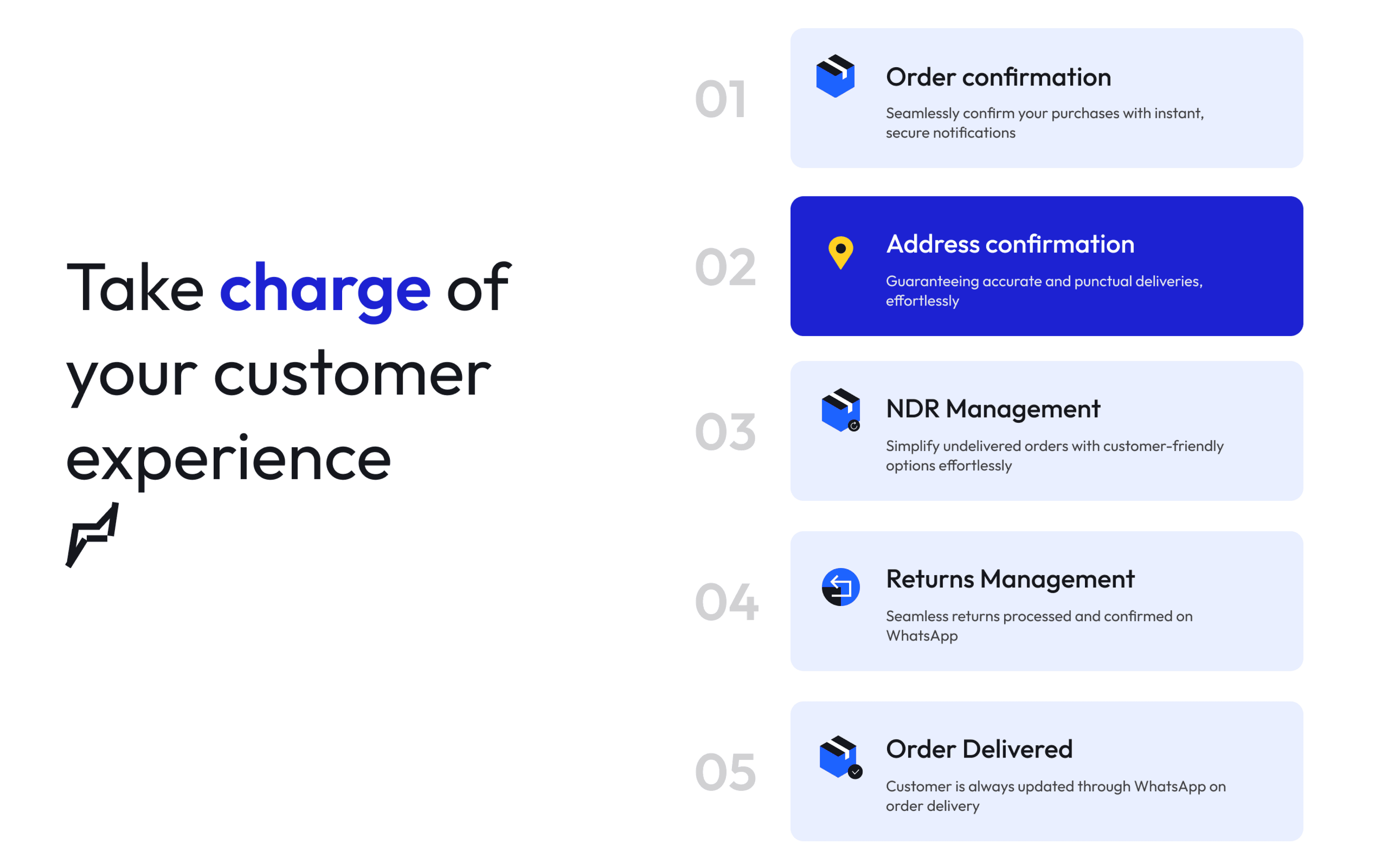
the first fold now carries one value proposition, with shifting text and a custom cityscape that narrates the service at a glance. below it, progressive disclosure and modular content blocks serve skimmers with scannable headlines, and decision makers with the detail they need.

PROCESS
3/ plain words for a complex process.
the old process page was full of technical terms. i rewrote it in plain, layman-friendly UX writing with supporting text, so people instantly see what’s expected of them and what quickshift does next. progressive forms and chips keep the effort low.

OUTCOME
one site, organised around who’s visiting.
[add whether it shipped, and any results you can share.]
04
audiences served by one site, without separate sites for each.
01
value proposition in the first fold, where the old homepage had competing visuals.